
User Research
Preface
Products that value user research in the design stage, often, enjoy greater success in product impact. Sometimes it takes effort to convince an organization of its importance, due to the time and financial investment it requires, but at the end of the day, the ability to justify design decisions with evidence from research proves quite significant.
At PowerHub, Plans module is one such example that would have benefited from user research. Even though it was a client-requested module, it is not currently being used (even by said client). While redesigning forms on our platform, I tested different methods of user research to find out how we might implement a user research practice within the organization successfully for future module and feature designs and iterations.
Case Study: Forms
Task
To find out what user research methods would work for our company and workflow.
Problem
Forms was a huge part of my research for Filters & Queries. When the Director of Product suggested using the filter form in the Tasks module as a user research opportunity, the initial questions were: what are best practices for form design and how do they apply to our users?
Team
1 User researcher (myself - designer)
1 Director of Product
Timeline
2.5 - 3 months (no hard deadline)
Challenges
No defined KPIs (What would define a successful research? When would we “finish” exploring?)
No direct access to client users (only Customer Success Team and Product Team)
Initial Research
Before anything, I started by researching studies and articles that have already been produced on the topic of best practices for form design. Going into it, however, I had the understanding that forms, as most often referred to online, may not be the type of data-centric forms that PowerHub’s Lithium platform uses for asset management. Generally, the best practices I found related more to light survey style forms with the common purpose of collecting marketing data. That was not to say that this initial research was not helpful. I believe that we can integrate this easily digestible style of information gathering into our data-heavy Forms module somehow.

Initial research findings on best practices for online forms.
Interviews in three stages
I had, on hand, 18 individuals whose backgrounds ranged between customer success specialists, backend developers, quality analysts, and business analysts. In three stages, I hoped to determine what users generally prefer in form fields and form layouts and whether or not those preferences remain true when they actually use them. I wanted to see if what they say they like is indeed what they like and are able to use easily.
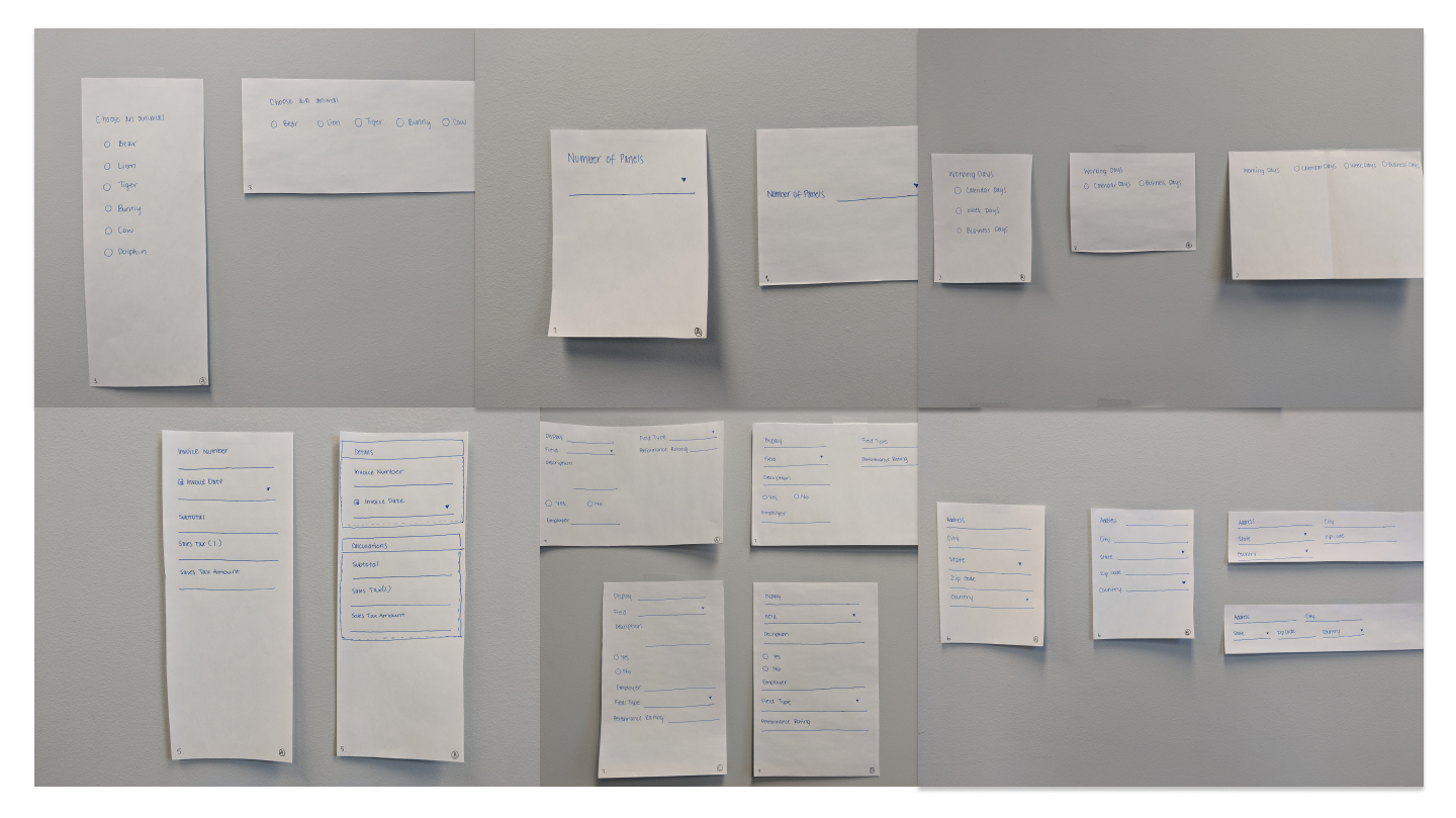
In the first stage, I sent out a Typeform questionnaire to see if and where were there commonalities in form field preferences. By writing out input types, users might recognize patterns they wanted in future form design within our webapp in written form. I also recognized that there may be inconsistencies when they see the form fields visually, from their original choices when they were written out. In the second stage, I sketched individual form field and layout styles for interviewees to select in a multiple choice format.
Quick sketches for initial testing: different types of form fields with varying content to draw correlations, if available. Variables included: Column Style (single, double, mixed);Sectional Dividers (yes or no); Label Alignment (top or left); Radio and Checkbox Alignment (vertical or horizontal).
Third Interview

In the last stage, I coded 5 different forms in html and css with varying question types. I decided against using existing survey services like SurveyMonkey and Typeform because they already had layout configurations I could not override in order to test for my questions on layout and content flows. All 5 forms had different questions in order to minimize the chance that interview subjects may get tired answering the same questions by the last form and let their fatigue affect their judgment of the designs. All 5 forms also had the same number of questions and the same form field types.
Some questions asked:
Is the layout easy to read through and answer?
How long does it take the user to complete the form?
How do they feel after completing the form?
Is there even a correlation between the time it takes to complete a form and their emotional state afterwards?
Where do the results of the final stage interview stand against what these users have said they wanted in the first two stages?

Tools used during testing: Voice Record app for iOS; Rode mic; Otter.ai (transcription post interview); Laptop with the html/css files (5 forms); Quiet office with good light
Instructions
“Thanks so much for taking 30mins out of your day today to help me in this last stage of the forms research.
Today, you’ll be filling out these 5 forms I’ve designed. They all have varying layouts and column structures, as you’ll see. I’d like you to go through each form and just fill them out. I’m going to have this mic on you so feel free to think out loud as you’re answering the questions.
You can say anything from, where do I click next to I don’t know what the answer is. There is no wrong answer because I’m just looking for how easily you’re able to understand the questions and the form structure.”
Results
User 1: textbox width doesn’t have to be very long if the answer will be short, size should depend on content; same for number inputs, if it’s a number it doesn’t even need to be as long as textboxes; slider should have range labels, the controls are cool though; did not read the date label and automatically selected today’s date; if questions are related in content, they should be horizontally next to each other to save space or put in the same section; the date icon doesn’t click (Materialize issue); upon Materialize calendar populate, user clicked Next > arrow quickly multiple times to forward to December from March, would prefer to be able to type in a date if it’s way in the future;
User 2: the date field is hard to click (Materialize issue); placeholder text should disappear or move up as a label when I start typing; prefers boxed checkbox style to the open checks; there should a “none of the above” option for selections; i want to type out dates that are far away instead of navigating through a calendar; number fields are too wide; horizontal layout of Form 4 is good, there’s too much space between question and answer field in Form 3, it’s hard to follow along; personal default width is 60% (same as Lithium) because user usually designs her forms with single full-width columns, it’s easier to click and drop that way;
User 3: tabs between fields (single tab press), frustrated with double tab required in Lithium (irregular compared to other applications); the tab helps figure out the flow of information, user doesn’t have to figure out where to go next and scroll to the next question themselves with a mouse; likes single column because it’s easy to understand the flow, just go from top to bottom; does not like a lot of space between question and answer field; user normally just types in a date in date fields; user normally tabs to the next checkbox and taps the spacebar to select, did not think to do that here; headers are a nice to have but didn’t notice them much because they weren’t bold; likes to have sectional dividers; liked Form 2 and 5 the most, might lean towards 5 more if the sections were clearer;
User 4: number field seems misleading, because it’s a big long line, user wanted to type in his answer and didn’t realize it was for a number; user enjoys the unboxed checkmark animation; slider without labels is a bit ambiguous; user does not like when the questions/labels are left-aligned; user tried to click on date icon several times (Materialize issue); number controls only appear on hover of number input field, if no hover, no indication; date should be typeable because what if a date for a project completion in Lithium is like 20 or 30 years in the future?; typing out a date should be intuitive of the format too, like you don’t have to know the exact format but if you start typing, the field will figure out what date you’re trying to type; if fewer radio/checkbox options, vertical alignment is nice but anything that’s longer should be horizontal because it’s easier to read from left to right and just select as you go; always felt that default width of form fields in Lithium should be 50%; user usually formats everything into 2 columns to maximize on space usage; the point of sections in a form is to be able to roll it up so maybe there will be people using headers just to show titles but user thinks the ^ roll up button is important;
User 5: Date icon should be clickable; not a fan of a date picker that disables everything else on screen; slider almost looks like a text field, the line needs to be visibly very different; user likes vertical-aligned radio/checkboxes but if there are too many options that it gets to be a scrolling issue, user would prefer to use a dropdown field; two columns is fine but more than two feels cluttered and hodge podge; only customizes form fields in Lithium from 40-50-60% (no less than that to avoid more than 2 columns);
User 6: not enough contrast between background and text; user’s instinct was to move from left to right (two columns for all questions) and then thought that she was supposed to go from top to bottom but then when she read the questions, realized that top-bottom flow doesn’t make sense, spacing between columns/questions should make flow more obvious; the line for the text field is a bit hard to see; user prefers Form 4 where questions/labels are left aligned but there isn’t a lot of space between the label and the answer field(s), flow is easy to understand (top-bottom), everything is read from left-right;
User 7: not enough space between top-aligned labels and the text line; there should be sufficient space between input fields to be clear that they are not one single connected line; number fields are too large, they should be different from text fields and be very short; if the form design relies too heavily on the user reading from left to right, it might start feeling less like a form and more like a novel; prefers when radio/checkbox options are all in one horizontal line instead of multiple rows aligned vertically; prefers Form 3 where the questions/labels are left aligned with a big space before the answer field (right aligned) because the questions are crisper and cleaner presentation, it’s a little bit long so the scrolling might be an issue but visually this is user’s favourite form;
User 8: user had clicking issues and flow confusion, was not sure where to go next at certain times; user likes 2 columns, 3 might be overkill but it really depends on screen size; in Lithium, sometimes you set up a form to look a certain way on laptop but then if you look at it from a desktop, it’s very different; avoids 3 columns or more because user does not like when text wraps to the next line; user prefers to have too much space than too little; user does not like all of the white space in Form 4 when it comes after horizontal aligned form fields; number values should always be super short input fields (no matter white space);
User 9: user wasn’t sure if the submit button was successfully clicked; two text boxes that are next to each other should be clearly two separate lines; Form 4 uses too much space between label and input field, too much work to figure out which field is for which question; having left aligned labels also make it a pain to align the label to the input field line correctly; calendar date selector doesn’t select on click of date, user has to re-open and click okay to confirm selection; slider question doesn’t make sense if my previous answer was no, it would be great to make conditional choices in the form, like only show slider question if previous answer is yes; user sometimes uses keyboard mainly for forms but today used trackpad for no particular reason;
User 10: user likes 2 columns as long as the information makes sense in that order; user doesn’t mind horizontal alignment of radio/checkbox options but is concerned that if viewport is smaller, he would have to scroll horizontally do answer questions; left aligned labels in Form 3 has too much space between label and input field; Form 4 isn’t bad; doesn’t mind if text wraps to next line; user enjoyed Form 2 and 5 the most (either 2 columns or mixed columns with section headers); Lithium usually tabs twice which is weird but user normally does like to tab to the next question, just didn’t do it for these forms;
User 11: user likes to use tabs and arrow keys when filling out online forms; user prefers to have both options for selecting dates on a date picker tool (to select visually and to type it out); user imagines Lithium forms will have to have a lot of 30% width form fields because there’s a lot of information that needs to be included and you want to avoid too much scrolling; user prefers vertical radio fields (originally said horizontal radio fields in previous stages but now in use, feels differently); if there are lots of options, he would probably still want horizontal radio fields; form field width is really hard to configure in Lithium because 30-30-30% looks a certain way on a laptop and then on a desktop or a tablet, the layout may change but it would be great if we could minimize amount of white space; user feels differently about system forms like task set up which would benefit from a lot of white space and wider column widths because those are step, step, step, done and not as data heavy; user really likes sectional headers (without borders), Lithium only has the divider option which also changes the amount of space available inside of the div and it changes the calculation of form field width 30-30-30% has to account for the div borders too; on date picker, user would prefer to be able to select by double clicking on date instead of having to click “okay”; in Lithium, the first thing the user always does as soon as he click and drags in a form field is to change the width from 60% to 50%; increments of 5% should be available; it would also be great to just copy a form field and paste paste paste paste but that’s not possible right now, we have to click and drag x-number of times and manually change width for each one;
User 12: user had issues clicking on the date icon; the placeholder label text is unclickable so issues clicking on input fields (Materialize issue); user prefers Form 2 to Form 3 because left-right flow makes more sense if it’s from question to question, not necessarily for question to answer (these need less space, you look at the question here and then have to follow along to go find the answer field there); horizontal lines can go too far and wide; in Lithium, some users don’t expand when filling out forms, they just fill it out in the little panel so we have to design usually for that size; but when you design forms for a smaller viewport like the panel, users might pull it open into an expanded window and then the percentages that you set are overridden, you might have designed it to be 50-50% but something small from the next line might move up to join these two columns;
User 13: user tried to press enter when finished with one form field, this action refreshes the page to the top again; tab works fine though but on tab and enter to select an option, the form field background colour changes; user found the alignment off on the left-aligned labels to the line of the input field; user felt the numerical fields were too wide, they should be smaller than text fields; slider was too wide for something with no labels; user continues to try to click placeholder text to start inputting answers; user mainly used the mouse for form navigation, user does not normally use tab or other keyboard tools;
Research Analysis & Conclusion
In order to easily identify common traits from the first two stages of user research (Typeform survey and the visual multiple choice sketches), I pulled all of the user names and their answers into a single spreadsheet. I colour-coded the answers by form field trait(s) and similar combinations. It simplified the data from a high-level point of view in quickly understanding whether or not our test subjects were consistent in their answers and if there was a consensus on any particular form field style: there was not.
The results showed that test subjects changed their opinions from question to question and there was also zero consensus on any particular form field style or overall form designs. The highest percentage of consensus on any single question was 69.56% agreement on a combination of top-aligned labels, vertical organization of radio/checkbox elements, and clear sectional divisions. This consensus was then debunked by other answers that pointed to contrary styles.

Some cells are empty because not every individual that participated in the first survey participated in the visual stage as well, and vice versa. The division between columns F and G splits between answers from the first and second stage. Consistency of colours matters less in the first stage because each question tackled a different form field type. Here, the variations of answers between all of the users by column matters more in demonstrating that we could not conclusively arrive at a definite consensus on any particular style. In the second stage, colour consistency matters more per individual by row because here, we presented more instances of styles per form field type and we are able to see how inconsistent each test subject is in their preferences.
Impact
None to report - it was a learning experience, conducting surveys, interviews, turning qualitative information into quantitative data for to analyze more effectively.
Lessons Learned
Shaping qualitative information into quantitative data points is really hard
Analyzing research results is even harder if survey options are not distinct from each other (if qualities blur lines, it’s nearly impossible to put a number - or colour code - onto it)