

Data Visualization
Some examples of graphs I’ve designed for PowerHub’s data-heavy platform; what I like and don’t.
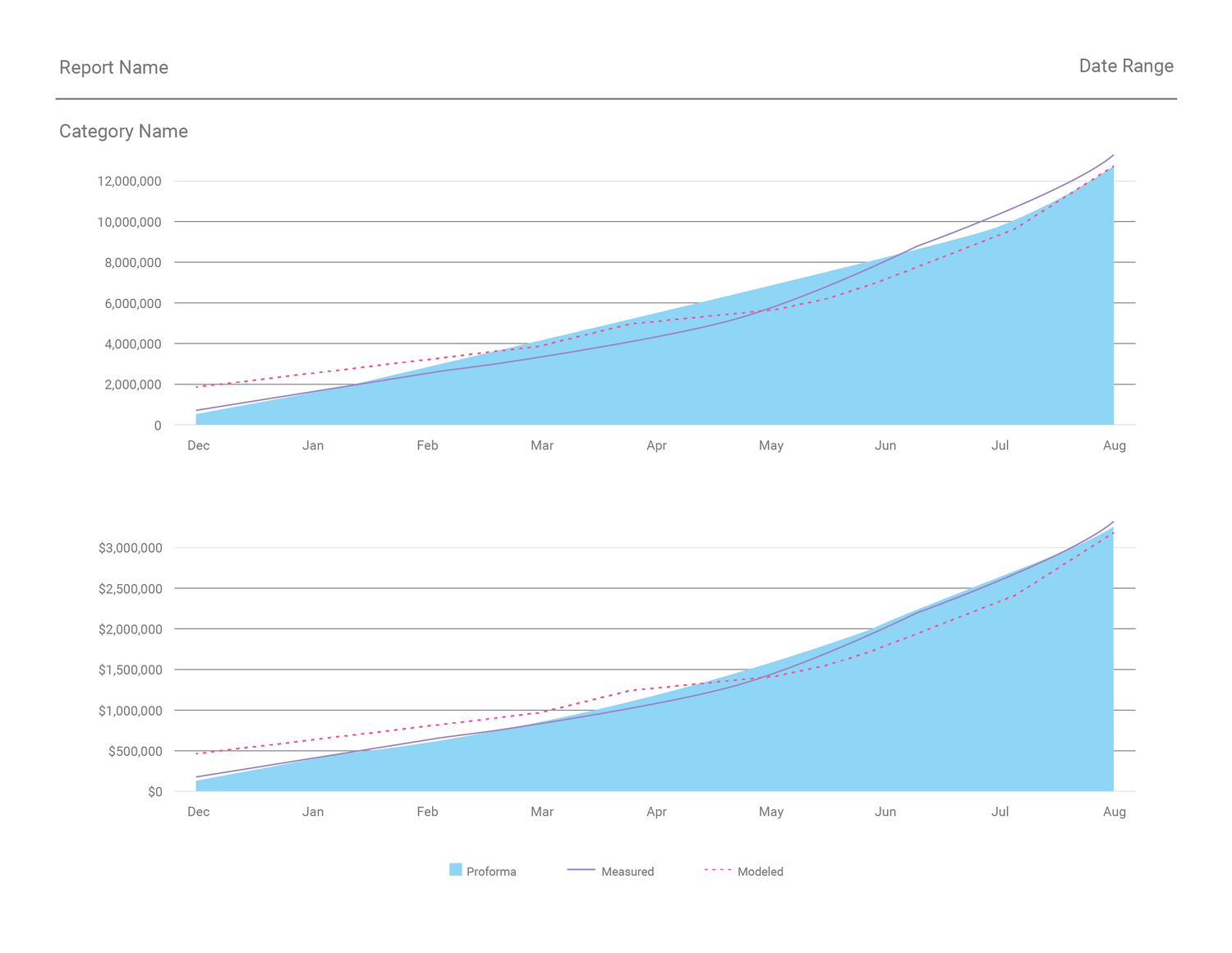
In extreme situations, depending on how much data needs to be compared to each other in a single graph, you might see something like the graph above. There’s essentially not too much value drawn from such a graph because it’ll probably take users a long time to decipher any meaning from it: for example, what was the Generation (kWh) in June of the first year?
I also wouldn’t recommend capturing more than 5 items at a time. If more are required, try to spread out the data points on multiple graphs.


Occasionally, there may be so many items to compare along an axis that the labels will not fit horizontally. If this situation is unavoidable, diagonal labels are necessary. I do avoid fully vertical labels because they’re not awesome for legibility.