

Alcohol retail app
Product Brief
This mobile e-commerce app (iOS and Android) allows users to browse and purchase alcoholic products and discover related content. Users are able to explore discover cards with curated product lists or to use the search functionality to find products they’re looking for.
The client was limited by various tech limitations (which they still are) but wanted to explore within the engagement, what can be done on the front end to mitigate negative user feedback on discoverability of new or familiar products within the app.
Goal
To improve speed and usability, product discovery, and accessibility.
Users
Customers
Store employees
Requirements
User can find a specific product they are looking for by category (Category PLP)
User can filter for a specific product (All Filters)
Constraints
Backend data is housed by various sources with technical limitations to speed and performance
Balancing business needs from stakeholders and expected UX for how information is visually organized (e.g. ordering product category names)

Category PLP: Certain product categories had up to four levels of categorization but for the most part, adding an additional Category screen in between the Shop and PLP screens helped users to drill down more efficiently and find the product(s) they were looking for.
Landscape analysis
We initially looked at app reviews, ratings as well as user feedback, in order to understand some basic unmet user needs. Performance was a recurring theme, as well as search being hindered by poor filter options. The scope included other existing and new features to be explored within the engagement (e.g. home screen, cart, order tracker, etc).
For Category PLP and Filters, we looked at other alcohol providers to learn industry standards for copy and information structure for this particular type of product. We also looked to other e-commerce apps for inspiration on sort and filter components and UX.
Hallway testing quickly determined that contextual filters were a better way to organize filters than comprehensive ones. The general consensus was that adding filters to a list of results in a PLP should decrease the result count.
Contextual filters narrowed down the list of results and gave users an understanding of hierarchy of products and their categories. Comprehensive filters (though some competitors use them) was confusing because there would be instances where a PLP heading read a product category name like “Vermouth” but because of the filters that the user was able to action (e.g. Beer & Cider, Ale), results would include items outside of the heading - confusing users more than helping them to find products faster.

UX
Because of the various data sources that inform the backend structure, it was important to document an app map throughout the engagement. At kickoff, we were able to visualize the complexity of all the screens and how many additional steps users need to take to access certain parts of the app. As we worked on different features or iterations within sprints, we were able to begin to simplify the app map and deliver more succinct flows with clear patterns.
The product search bar was a consistent component that remained part of the header but we wanted users to be able to discover products by organically exploring the app. We redefined the goals of the home screen in order to create a shop tab that focused on displaying product categories in a way that was easy to drill down and navigate.
We then explored different filtering components within other e-commerce apps to find a solution that makes sense for our client. The client was undergoing a brand refresh at the time and we maintained a component library in order to adapt to changing visual requirements at all times.

Solution(s)
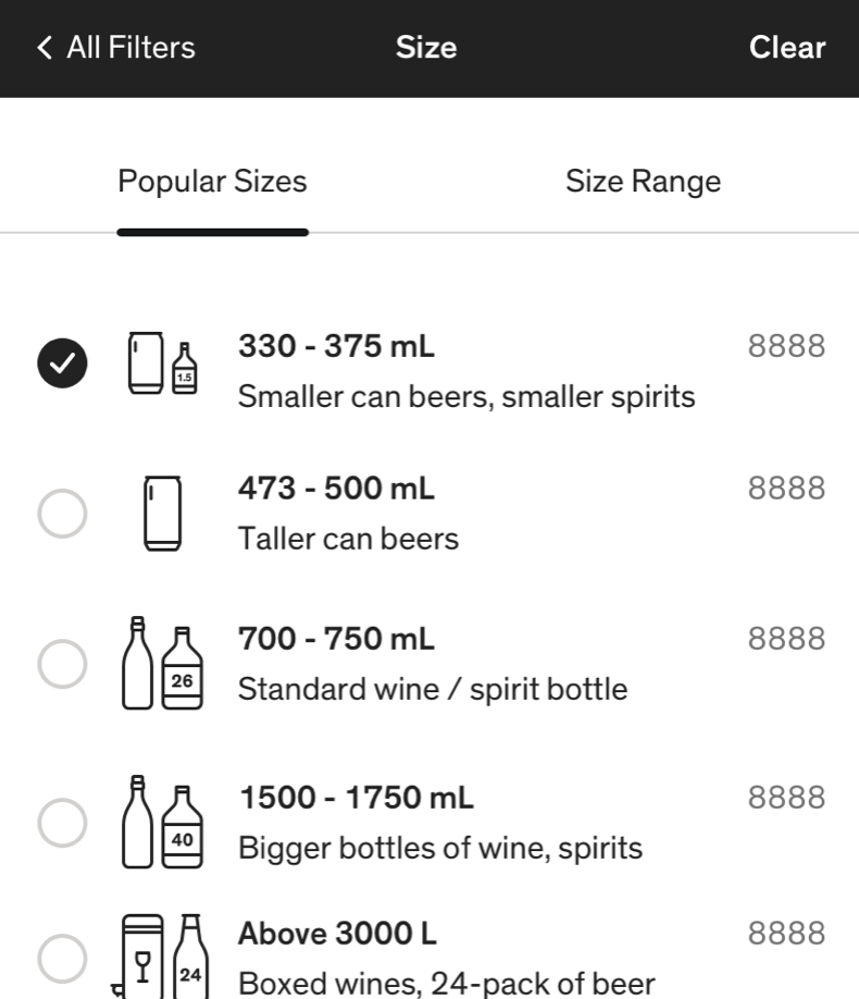
👣Filter categories in the All Filters screen would be contextual to the PLP that the user entered from
If entered from a search results PLP where product type is undefined, available filters would begin from Type
If entered from a category PLP where product type (and maybe also subtype) is defined, available filters would begin one level below that filter category (e.g. if Wine is selected, hide Type and display from Category)
🤳Keep the Apply CTA available only from the All Filters main screen and not from a filter category screen in order to manage different types of user input
🛣Transition between All Filters and filter category screens will vary, depending on input type
Radio action can immediately return to the All Filters screen
Radio action can immediately advance into the next filter subcategory screen
All other filter category screens where more than one action is required to action a filter will have an Apply CTA that returns them to All Filters
🔢Apply CTA will provide of [count] to set user expectations of the PLP they will be returning to

All Filters
Unearned reward detail modal
Participation Notes
Assisted researcher in conducting user tests in various sprints
Explored information structure via app map and flows
Provided wireframes to collaborate on visuals with UI designer